This is a tracker to show me where I need to improve in my blogs. As you can see I have plenty for similar products and drafting and planning but need to get target audience and organisation up more. Due to this I will be blogging about target audience and organisation more frequently to give my 'tracker' an equal spread. To focus on organisation I need to spread out my time when organizing photo shoots and making products. For target audience I also need to focus on ways I can pull in my target audience. The tracker is extremely useful as it shows me the areas I need to improve in.
Sunday, 30 November 2014
Thursday, 27 November 2014
Organisation
Next week I will definitely do most of my photo shoot in the drama studio. I plan to shoot most my pictures for the contents page, and one for my double page spread. I have decided to shoot my front cover outside of school as I plan to use an outside background which I think will benefit my work. I am also going to take one of my pictures for my two page spread outside of school as I will have more space to work with, as I have a certain plan for this picture. In the drama studio I am going to use the lighting to effective and shoot the bands, D and B and Ancient Thirteen as well as artists Flyn, Curjew, Jake and Ben. I will use mostly close ups in the drama studio as all of these people are going to feature on the contents page. However I will use a mid shot for Jake as he is my main story in the magazine so he should stand out.
I will use little props in the drama studio, which will probably be sunglasses or some cards, for an idea I have. However I may change this if the image does not look good enough. Outside of school I will use a guitar as I plan to use that for effect which links in with my main article story for my main cover star Jake.
Tuesday, 25 November 2014
Organisation: Facial expressions
Facial expressions are used in magazines to give the target audience a bit of an insight into the bands personality. It can show the audience if they are rebellious or if they are serious with their music. It can also create a connection with the audience through direct address as the main cover star is addressing the audience. It is important that I understand how I can attract my audience and make my magazine look professional using facial expressions so I know which one is the best one to use for my front cover.

This is a front cover from NME. Due to the cover stars facial expressions being blank it shows that they are very serious about their work, yet a bit rebellious due to the sunglasses. This shows the audience that they take there work seriously, while being rebellious which creates a unique coolness for the band. This helps draw in their target audience. Also because they are not giving direct address this once again portrays them as rebellious as they are not addressing the audience.
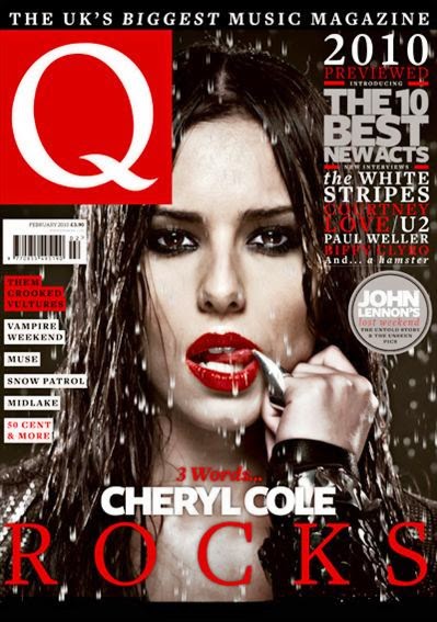
This front cover is very effective. Her facial expression plays a big part as she is giving direct address while licking her finger. This gives off a very seductive look which shows the audience that she is rebellious and sexy which helps pulls in NME's target audience as they are mostly young people and this rebellious sexy approach helps create a really effective front cover. They also draws in the audience as they will want to see why Cheryl Cole, this huge pop idol, has taken this rebellious approach as there must be a reason why she is taking this approach.
This task has helped understand how facial expressions can be used to attract an audience as well as creating an extremely effective front cover. I can refer back to this blog when making my front cover to make key decisions, such as whether or not I will use direct address which will help me create the best possible magazine.
Monday, 24 November 2014
Drafting and planning: Fonts
I have decided to call my magazine LGM, and I need to find different fonts to use. Therefore I have decided to use different fonts to use for mine.

These are the fonts I decided to use. I have kept them simple and made them quite bold to help pull in my target audience. Personally I like the second font the best as it is a bit sketchy and I think it suits my music genre which is alternative rock. My second favorite is the last one as I like how simple it is and it reminds me a lot of NME logo. Finally my third favorite is the top one as it is big bold, and effective and will help grab the readers eye. Also it will help with my left third once again helping it grab the readers eye!
Thursday, 20 November 2014
Similar Products

Wednesday, 19 November 2014
Organisation: Where to have the shoot?
I have recently been looking at two page spreads from NME and Q. Both vary in where they shoot their pictures. I need to decide whether or not to shoot my picture outside or indoors. By having a shoot outside it gives my band a bit of mystery and a bit of their personality. For example if I shot it in the town center it would give my band some class and show the audience that they are into the high life of fame and shopping etc. However if I decided to shoot my photo in the woods, my audience will wonder why it's shot their creating mystery about my band. However there are also many perks of having my double page spread shoot in door. By using the wall as a background it makes my band the main focus which will help bring in my target audience.
Personally I would like to do my front cover indoors and my two page spread outdoors, however it all depends on whether or not I can find the correct venue. This task has show me how the venue of a photo shoot can help make your target audience think and bring them in and will help me when making my two page spread.
Personally I would like to do my front cover indoors and my two page spread outdoors, however it all depends on whether or not I can find the correct venue. This task has show me how the venue of a photo shoot can help make your target audience think and bring them in and will help me when making my two page spread.
Tuesday, 18 November 2014
Similar Products: How Bands set up an image

Similar products
I need to decide how much I should make my magazine, LGM. To do this I have looked at 4 music magazine prices and used my results from SurveyMonkey. The four magazines I have used are NME, Q, Kerrang and RockSound. NME is priced at £2.50 which is quite cheap for a music magazine. Q magazine is priced at £4.99, while Kerrang is £2.20 which is very very cheap. Finally RockSound costs the most at £5! Despite RockSound costing the most it still has a circulation of 13,200, while NME has a bigger circulation of 19,491! However Kerrang has an even bigger population of 37,603, while Q magazine has a circulation of 52,781 which is the biggest of the lot. However looking at the results I got on my survey most people would only be willing to pay £2.50-£4 for a music magazine. As Q magazine is £4.99 I am cannot use that price as most people would not pay that. Therefore I am gonna go half way and price LGM at £3.50. This exercise has helped show me how price can be the difference in getting a lot more of your target audience to buy your music magazine.
Thursday, 13 November 2014
Remake Remodel feedback: Organisation
Today I got my feedback for my remake remodel task. I was praised as I have used my main image consistently on my cover, content's page, and two page spread. I have also clearly organised my photo shoots and aimed it at my target audience by using associated bands. The image on my double page spread was also praised as my cover star is showing attitude by having his hands in his pockets. This shows the readers that 'Flyn' is a bit rebellious and also makes my double page spread look like one used in a music magazine. Finally I was praised for clearly planning my product and the layout is mostly good but just needs a little bit of tweaking.
To improve I need to perhaps use the subheading for my contents page to help make the exclusive interview stand out and I should include more photo's associated with the cover lines. This will help make my work more consistent and coherent and I shall do this as it will help make my real magazine better. For my contents page as well I need to use a better image as my image looks very poor without a background. Also my music star does not really look the part in my contents page. I should also perhaps use another column to separate my other stories from my main one. For my double page spread I just need to add in more text and perhaps use a more professional font for the pull quote.
This task will help me in the future as it has shown me how I can make my work more holistic, coherent and consistent. It has also shown me how important it is to organize my photo shoot, and making of the magazine with enough time to pick out and make improvements. I can also use this feedback as a checklist when making my real product which will help me achieve a higher grade.
Wednesday, 12 November 2014
Organisation: props

Guitar
Now I could use a guitar as I may have a solo artist on my front cover and the guitar represents their music and shows the audience how much they are into music. I can easily get a guitar as I used to play, and I think this could be a good prop as it will show the audience the band members personality and look effective. However it would only work with a solo artist.
Sunglasses
This prop is best used for a band of 4 on a front cover. You usually see Alex Turner of the Arctic Monkey's wearing sunglasses, this is because it helps show the audience that he is the lead singer, and also show's him to be rebellious. Also to attract 'simpler' fans it looks cool. I have only thought of two bands at the moment but one of them is a band of 4 called Ancient Thirteen so using sunglasses as my prop is a major possibility.
If I can find anymore props to use then I will but at the moment I could use these two as they are easy to get and I currently think I will either have a solo artist or a band of 4 on my front cover. This activity will help me in the future as it will help me when deciding what prop to use
Tuesday, 11 November 2014
Drafting and Planning: NME Contents page and 2 page spread: remake remodel task

This is my draft contents page for the remake remodel task. I had my main story as Flyn in the middle with a picture and some quotes as that is what NME do and this is an NME contents page. I then drew up and index of page numbers on publisher and inserted it into paint. I then used bands usually in NME such as Arctic Monkeys and Foo Fighters. I then went and looked at NME contents page in the shops and in the issues I looked at they had prizes can be won at the top and an advertisement for a band. So I got an image of the MUSE who are usually in NME and did an advertisement for them then added in prizes to be won.
I used a white background as that is usually used in NME and kept the fonts simple and easy to read but still big and bold for effect. Finally I used WordArt to make my This week sign then put it together with an NME logo and imported it into paint, thus finishing my contents page!

One improvements I need to make is that I failed to put page numbers on my double page spread. It is vital that I include this because while it is a simply convention it is the biggest because if I don't have page numbers then my target audience won't know where my main story is. Also there is not a consistency between my front cover and contents page, as Coldplay does not feature on my contents page but is on my contents page.
This task will help me in the future as it has helped me find out what I need to include when making a contents page and a two page spread!
Saturday, 8 November 2014
Target Audience
I have decided to look at NME magazine and Q magazine to help me learn what will help attract my target audience. I used these two magazines as the are the same genre as my magazine, LGM and have the same target audience as me, alternative rock fans!
FRONT COVER


CONTENTS PAGE


Q's contents page is very different to NME! It has the main cover star taking up most the page and the arrow indicates to the reader the interview is on the next page making it quick and easy for Q's target audience to recognize the cover star then read the interview. The index is on the left giving the reader an insight with the main stories in bold, like NME's drawing in the target audience as they can see if their favorite band is in that issue. There is also a summary of another story across the bottom making the reader buy the magazine to read the extra story (like a screamer)!
Both of these contents page help get the magazine's target audience by having an image of the main cover star, and the interview page and in the index having each section in bold to show their target audience that their interest is in the magazine. I will use both of these things in my contents page and will also add a subscription ad in it like NME's!
Double Page Spread

This is Q's double page spread of an interview with Ed Sheeran. It keeps to the conventions of a two page spread by having the main image on one side and the interview on the other. What grabs their target audience here though is the colour's used. It really complements the picture of Sheeran and London and is used in Q's colours, red and white. However the fact that the colour scheme is so simple makes it effective and draws in the reader. Also the photo make's Sheeran easy to recognize bringing in his fans and the picture of Big Ben is an excellent background as it makes Sheeran the main attraction.Also there is a pull quote giving the reader an insight into the interview. Finally the fact that Sheeran isn't looking at the camera helps bring in the audience as it shows he's a bit rebellious as he is not giving direct address.
 This is NME's double page spread from their interview with Arctic Monkeys. Once again the colours are simple, black on white, thus making it easy to read and effective and the main image is on one side with the interview on the other. However this double page spread gets the target audience attention as the pull quote is used in a different font. This font is a nice big bold font making it easy to read but as there are lines everywhere it shows a bit of the bands personality, implying that they are rebellious. This contradicts the picture where they are giving direct address making them seem innocent. This will only make the reader want to buy the magazine to read the interview to find out what the band are really like.
How Will This Help Me?
This activity has helped me a lot when drawing up a plan for my front cover, contents page and double page spread. It has shown me what is needed to attract target audience, such as how many cover lines I need, whether or not to use pugs, showing me to keep the colour and fonts simple and clearly telling them where everything is on the contents page. It has also showed me how I can portray my bands personality's by using direct address or not!
FRONT COVER
This front cover is of Coldplay from Q magazine. First off is that the main cover stars are an alternative rock band which will grab their attention. But also in the cover lines are other alternative rock bands which will grab more fans who are not fans of Coldplay, the main cover stars. There are the typical codes and conventions such as a bar code and left third, but what grabs the audience is that all the cover stars are looking straight at the camera giving direct address to the reader, thus pulling them in.
This is a front cover from NME magazine and is similar to the Q one. Once again the main cover stars are an alternative rock band and are giving the audience direct address. However what pulls in the reader is the fact that at the top it has 'special collectors magazine' and all the cover lines are about Arctic Monkey's, not other bands. This will help not only get in plenty of Arctic Monkey fans but also people who are 'collectors' of the magazine.
Both these front covers do not contain pugs and or a screamer which have been used on other front covers. This is another way to attract target audience and I will use them on my front cover despite them not being on these front covers. Also these front covers have taught me not to use more than 5 front covers, letting the focus stay on the cover stars and to keep the fonts simple.
This is NME contents page and this is extremely effective in pulling in their target audience. First off they have a picture and a summary off the main story giving the audience an insight into the main interview and getting them hooked as they will want to read the rest. Next on the right hand side they have a brief index on where things are with the topic in bold eg features and reviews. This is helpful as it will show the reader where the story is which they want to read, saving them time or letting them now it's in there making them buy the magazine. Finally on the left there is a index with what is on every page once again giving the reader an insight.
Both of these contents page help get the magazine's target audience by having an image of the main cover star, and the interview page and in the index having each section in bold to show their target audience that their interest is in the magazine. I will use both of these things in my contents page and will also add a subscription ad in it like NME's!
Double Page Spread
This is Q's double page spread of an interview with Ed Sheeran. It keeps to the conventions of a two page spread by having the main image on one side and the interview on the other. What grabs their target audience here though is the colour's used. It really complements the picture of Sheeran and London and is used in Q's colours, red and white. However the fact that the colour scheme is so simple makes it effective and draws in the reader. Also the photo make's Sheeran easy to recognize bringing in his fans and the picture of Big Ben is an excellent background as it makes Sheeran the main attraction.Also there is a pull quote giving the reader an insight into the interview. Finally the fact that Sheeran isn't looking at the camera helps bring in the audience as it shows he's a bit rebellious as he is not giving direct address.
How Will This Help Me?
This activity has helped me a lot when drawing up a plan for my front cover, contents page and double page spread. It has shown me what is needed to attract target audience, such as how many cover lines I need, whether or not to use pugs, showing me to keep the colour and fonts simple and clearly telling them where everything is on the contents page. It has also showed me how I can portray my bands personality's by using direct address or not!
Thursday, 6 November 2014
Organisation
Today we peer assessed each others remake remodel task. This let me know what was good about my magazine and what I need to improve on. I have used most of the codes and conventions and got the right lighting thanks to my organisation over 2 weeks.
However I need to improve on getting clear image which will help show the audience who is on my magazine. Therefore I need to work better on organizing a photo shoot so that my pictures are clearer and my work can be improved!
This task will help me improve my work as it has showed me that I need to use my organisation a bit better when it comes to getting a photo!
Wednesday, 5 November 2014
Drafting and planning: Content pages

This is a content page from NME magazine. As my music magazine LGM is based on NME, I will use this contents page as a base when making mine. What I like about this contents page is that the main story has a big picture and a little paragraph summary. This helps draw the reader in and tells them what is in the interview, giving the reader an insight so I will use this in my contents page for my main story. The image used also gives the reader an insight as it shows what band is being interviewed. I also like how on the right is other major stories but they are divided into categories, like 'Live' and 'Radar'. This makes it easy for the reader to find the specific category they want. However I think that is enough when telling the reader what page everything is on so I would get rid of the left column of index when making my contents page. Instead I am going to use that space to advertise subscription, and will then use any empty space for company info and who produced the magazine. It is important that I find space for this because by giving details about the people who produce my magazine I will be giving my readers and insight into how big LGM is. Also a subscription add helps pull in readers who are really into the magazine and want to buy every copy so it is crucial I have space for that.
Tuesday, 4 November 2014
Target Audience :remake remodel task

This is my magazine cover for the remake remodel task. I decided to use NME as my magazine as that is what I am basing my real music magazine on. I decided to do a a long shot of my cover star so you can see his arms crossed and this shows the audience that he is rebellious. I then put my main cover line in red so it is clear that is the main story. The colour red shows that it is the main story because it is bright thus catching the target audiences eye, and all of the other lines are in a different colour, therefore showing the target audience the distinct difference in the stories.I also used major bands to help get my target audience as bands like Arctic Monkeys and Foo Fighter are very popular. Also Arctic Monkeys and Foo Fighters are bands that really appeal to NME's target audience which is mostly indie/rock fans. I also used a pug by offering a Coldpaly signed album and a Kings of Leon interview to once again help reel in my target audience.http://lewisglennonmediawork.blogspot.co.uk/2014/09/drafting-and-planning-nme-creative-task.html. I also kept the generic codes and conventions such as barcode, website, price, and dateline. It is key to add in this codes and conventions because they are part of my magazine, and if I don't include them, then my work is not meeting the task of making a music magazine. This is a link to my NME creative task I did near the start of the course. This helped me when importing pictures from Paint.Net to Publisher to add cover lines etc, and has helped me with this piece of work.
Sunday, 2 November 2014
Drafting and Planning

Also the photo shoot being shot outdoors by a caravan. This adds mystery to the band as you don't usually see a double page spread in a music magazine being outside. Also this will help pull in the reader as they will want to know why the band have been shot there because it does not really reflect the band, thus adding mystery.
NME use this a lot, but not many other music magazine's do and if I use this in my two page spread it will make mine look more professional and tell the audience who my lead singer is. Therefore in my photo shoot I will bring props for my lead singer and make the other band members stay in the background to distinguish them from the rest of the band!
Subscribe to:
Posts (Atom)