
Tuesday, 30 December 2014
Target Audience
There are two things every music magazine uses to help bring in their target audience as well as the main cover star. They are pugs and screamers! Pugs are used to offer prizes mostly to the target audience thus making them want to by it so they have a chance of winning. They are scene on most front covers in a circle.The pug of this front cover of NME is the circle saying 'Farewell Astoria'. This does not contain a competition as pugs can also be used to mention a famous place to once again bring in target audience as the fans will know all about the place and will want to read about it, however pugs are mostly used for competitions. There is also a screamer on this front cover and it is at the top about Arctic Monkey's new album. Screamers opt as another big interview or story in the magazine but is not the main cover line. This is to make the target audience think 'what two big stories' wanting them to buy the magazine even more. Pugs and screamers are incredibly useful when trying to pull in target audience and when I make my real front cover I will plan to use appropriate one's to help me reach my target audience.
.
Sunday, 28 December 2014
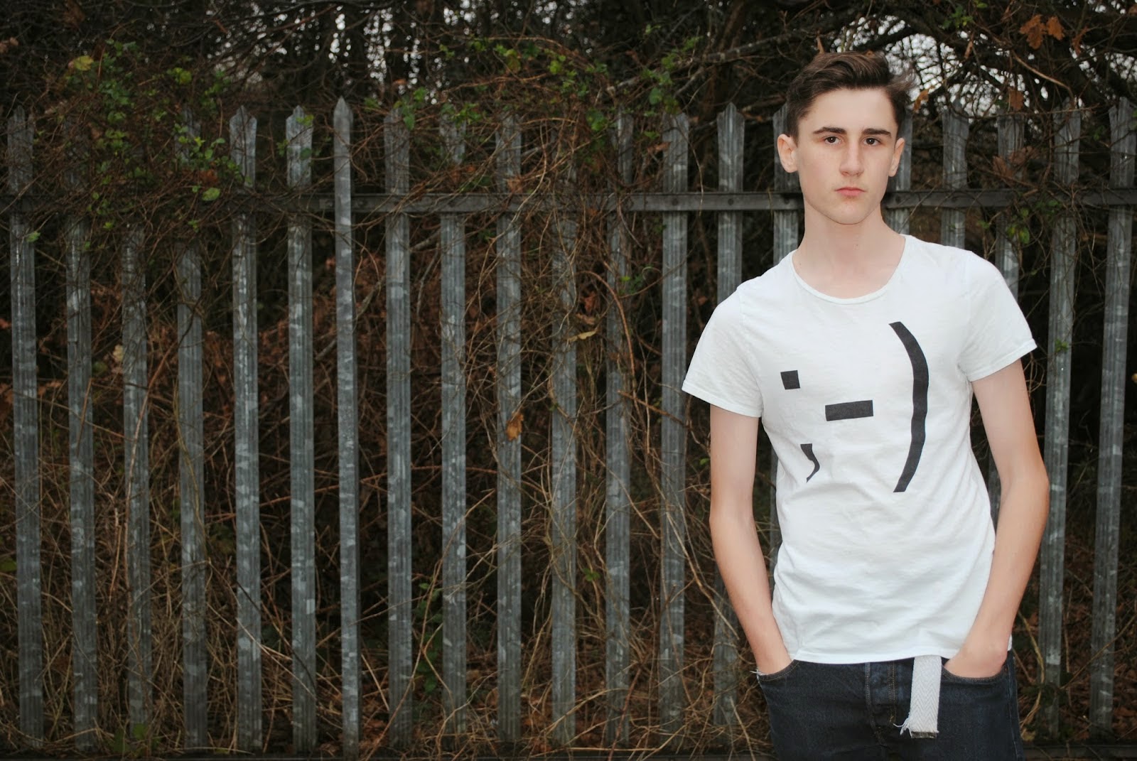
Organisation: Photo's I did not use for my contents page


This is another image for my contents page I chose not to use of 'Nick Frost'. Just like the first image there are two reasons I decided not to use this image for my contents page. The first reason is the fact that you can see his finger sticking up in the shot. Like the previous picture this does not look professional as the finger salute he is doing is one used by 14 year children now and days, and not something you see on a contents page of a music magazine. If my target audience was 14 year old teenagers then I would of probably used this image but because it isn't I had to go for a more serious and professional picture. The second reason I decided not to use this image was due to my reaserch into Q magazine. In an addition of Q, Ed Sheeran was the cover star and they shot his interview at his old school. As I have based 'Nick Frost' on Ed Sheeran, (the ginger hair is just a coincidence), I decided to do this as well to help pull in target audience as it is something different. Therefore for my contents page of Nick Frost I shot him with some boards of work behind him as I plan to do his interview about his school life which lead to him getting into music. Therefore the plain background of this picture won't tie in with that story which is why I opted not to use this image.

These are the images of 'Neb' which I did not use for my contents page. For the first image I decided not to use it because it is an extreme mid-shot, as you can see most his body as well as his face. These type of shots are rarely on contents pages of music magazines, and when they are it is usually for the main interview. As Neb wasn't my main interview I thought it was useless to choose this picture because it does not go with the connotations of a contents page. The reason for not using the second is the fact that 'Neb' looks serious but slightly depressed. Oblivious I want him to look serious but I don't want want him looking to down as my story is about how happy he is on going solo, therefore I want him to look serious but a but more upbeat then he is in the second picture.
Saturday, 27 December 2014
Organisation


When I made my draft front I struggled with my background, and ended up having to re due my photo's and putting in the white background, before deciding just to keep in my original background. So to help me for my real front cover I have decided to look at front covers I have analysed before from Q,NME, and LadyGunn to help me see what is needed to improve my front cover. The backgrounds for each front cover are simply a plain white wall, so the main cover stars are the main focus but also it makes for an effective front cover. Also in each magazine there is different lighting, and in my opinion Q's front cover looks the best due to the bright lighting, which really complements the background making the main cover stars stand out effectively. In each cover the main cover stars are also giving direct address which helps bring in target audience as they are addressing them. Finally the use of props is effective in the second magazine it links in with the cover lines. This shows how props can make for an effective front cover.
This blog has helped me a lot because it has showed me that when it comes to organisation photo's for my front cover I need to plan better, and pick out the a plain background, the appropriate lighting, whether or not to use props and to driect my cover star into giving direct address.
Wednesday, 24 December 2014
Organisation: Photo's I did not use
These are the photo's I decided not to use for my double page spread .There are many reasons why I chose not to use these pictures.
Double Page Spread Pictures


 These are the four images I took for my double page spread, however I decided not to use these images. I was going to use the first one as it is a great picture with the natural lighting being perfect for the picture, as well as there being space for the pull quote. Also the hands in pockets, show a none caring attitude which fits in with my story about 'Jake.' However I decided not to use this image because I thought it was to spacious. As I used quite a small pull quote it would of left to much free space on my double page spread and looking at Q's double page spreads it has space but not to much of it. Also I wanted Jake to give the reader direct address to engage with his audience as he is retiring from music and while the first image is good, he is not giving direct address, and that is why I decided not to use that image. The second and third images are very similar and once again I like the light and the cover stars pose, but as he is standing centrally it would of been very difficult to add in my pull quote as I would be working in a very small space. Finally the final picture has the perfect amount of space for me to add in a pull quote and make a good double page spread as Jake is standing to the right. However after importing this image in PagePlus I discovered that Jake is hanging off of the two page spread which I do not want, and when I tried to crop the photo it did not look as good which is why I did not use the final image for my double page spread.
Double Page Spread Pictures
Tuesday, 23 December 2014
Drafting and Planning

Tuesday, 16 December 2014
Organisation: Improved front cover
I have looked back at my front cover which I made last week (http://lewisglennonmediawork.blogspot.co.uk/2014/12/organiasationfront-cover-analysis.html) and I have decided that it does not look like a professional music magazine, as the cover lines are poor and I cropped out the background. So I decided to do it again keeping the white wall background in and looking at different fonts NME and Q magazine use. I also changed my masthead to just LGM instead of LGM magazine as it was to long and did not fit in with the codes and conventions. So i trimmed it down to LGM to keep it short and simple and it is like NME. I then imported my picture from Paint.Net to Publisher so I could work on cover lines. I quickly added a screamer at the bottom and a pug to help pull in my target audience as they will want to win the signed album of 'Crawling Back To You' as I have portrayed it as a massive album and Jake as a massive star. Also I have portrayed 'Flyn' as a big star so they audience will want to read his interview. I also re-evaluated my cover lines and kept the fonts simple, effective and easy to read. I also made the main cover line red, and the others as black to show the audience that Jake is my main story. I also made the name'Jake' bigger so my target audience will see his name and want to read his interview. I also used a pull quote to show the audience a glimpse of the interview. I also used a midshot so the audience can see the use of the prop, the guitar, and this will show Jake is focused on his music. The white wall background made it easy as it is nice and bright. Finally I kept to the codes and conventions of a music magazine by adding in the publishers, a barcode, the price and the dateline!

Monday, 15 December 2014
Drafting and Planning:contents page analysis
.jpg)
This is my finished contents page for my magazine LGM. I based it around NME magazines contents page as they are the magazine I have researched the most into. I decided to split my page into columns to make it look more professional but also to separate the main interview from the side stories. I decided to make one half of the side interviews in a red font and the other half in a black font to symbolism that the stories on the left are more important stories. I also added in a subscription advert to attract my target audience and featured pictures of everyone in this edition of my magazine to show my target audience who they are and once again to attract them. I kept my fonts simple yet easy to read and this fits in with what fonts NME use.I used mid shots for all the side acts but used a long shot for Jake as he is my main interview and so the audience can see his prop which shows he is very good at music. Also for the picture in the bottom right corner I decided to keep the background, because in Q magazine they had Ed Sheeran on their contents page at his old school, and as Nick Frost is the new kid on the block I planned to make him go back to his old school which is why I kept in the background. Finally I made my header big to show the audience that this is the contents page and what it will feature. I think to improve this contents page I need to re-organize another photo shoot or use some different pictures because it parts of the contents page it looks a bit plain for example the image of Jake I have used. Therefore to improve this I will use a different software to construct another contents page with different images to see how it looks. I will keep some aspects of this contents page as some images are real good images and I have used simple but effective fonts. I also like the use of columns for a contents page because NME use it and it clearly shows my target audience what the main story is as it is sort of separated from the other stories.
This task has helped me pick out some key bits of a contents page and showed me how to construct one. I can use this as a base for making my real contents page to help me create a proper music magazine contents page.
Thursday, 11 December 2014
Organisation: Double page spread photo shoot


This is the final picture I made which I will use on my double page spread. Obviously I will add the interview next to it, but I decided to use a pull quote which sums up the main interview about Jake retiring from music. I really like this picture because the lighting, the colour of Jake's top and the colour of the quote all complement each other extremely well!
Wednesday, 10 December 2014
Organisation: Who produces my magazine?
Every music magazine is produced by a company and I have decided to choose IPC Media-Inspire as the producers of LGM magazine. I have used IPC Media-Inspire as my producer for two reasons. Firstly they produce NME magazine which I have based my magazine on, so therefore I researched into them. IPC Media are a huge production company and sell over 350 million copies of magazines each year. It also produces magazines such as Chat and World Soccer which are well known magazines. Also it is a British magazine production company which ties in with LGM magazine as I want them to have a British air to it, ie it mostly features British artists and is a British magazine so it must be produced by a British production company. Also the second reason I want IPC Media producing it, is the fact that they are a huge company and I want my magazine to be portrayed as quite a popular music magazine so it must have a big production company backing it.
Monday, 8 December 2014
Organisation:Front Cover analysis
This is the front cover for my magazine 'LGM'! It features solo artist Jake who had decided to retire from Indie Rock music. I decided to use all my fonts easy to read and simple but quite bold to stand out. I also used the picture of my main cover star holding the guitar as he is not giving direct address which shows that he is rebellious but also shows no emotion which fits in with the main cover line about him retiring. I also used the 5 artists I said I would in my previous blog post,http://lewisglennonmediawork.blogspot.co.uk/2014/12/organiastion-who-else-will-feature.html, as cover lines and used a real band in the form of Coldplay as a screamer to help me bring in more of my target audience. I also used a pug to help bring in my target audience by offering a signed album which will be talked about in my two page spread. Finally I kept to all the codes and conventions of a music magazine by putting in a bar code, dateline, and a website.

Sunday, 7 December 2014
Organiastion: Who else will feature?
On my front cover I will need other artists to use in my cover lines and to use on my contents page as they will feature in the rest of my magazine. I have drawn up a list of 5 other bands/artists to use. They are D and B, Ancient Thirteen, Flyn, Nick Frost, and Neb. This will tell you a bit about them:
D and B- A due who have been together for 2 years and are still a bright up and coming indie rock band. I am going to portray D and B as guys who like a laugh but take their music very seriously, so I will probably have a close up of them laughing for my contents page. I will not use a prop as I want them to be the focus so the audience can see their personality, due to them laughing. I will get to friends to pose as D and B and I will use their new album as the story for the cover line.
Ancient Thirteen- The 'three musketeers,' Ancient Thirteen are based around the Arctic Monkeys, and will poses that rebellious attitude mixed in with class as shown by their clothing and hairstyles. They have been on the block for a few years now and are well known for producing good quality music. I will get three friends to pose as Ancient Thirteen and will use sunglasses as a prop to give them that added class and 'swagger'. I will probably use a mid shot for the contents page to show their body language and their rebellious side, and will describe their cover line as ' A wild five years, but more to come' to show that they are not done yet. However I will probably have to shorten the cover line as that is to big to use.
Flyn- As seen before in my remake remodel task, (http://lewisglennonmediawork.blogspot.co.uk/2014/11/remake-remodel-task.html) Flyn is a solo artist with a bit of attitude but still a love for music. About to hit his prime he will discuss where his love for music came from. The Remake Remodel task has helped here as I have already built up a 'profile' for Flyn and will know how to portray him when taking my pictures. Once again I will use a mid shot for Flyn so the audience can see him with his hands in his pocket which will show attitude. No props will be used.
Nick Frost- Next to my main cover star, Jake, Nick Frost is the next big thing. Full of confidence and loving life he oozes class as he relives the last few months where he has broken into the music industry. The cover line will discuss his blockbuster few months and I will simple use a close up of him smiling to show his confidence and that he is happy with his new found fame. I will also use headphones as a prop to show his love for music.
Neb- Finally Neb has been in Indie Rock for around 10 years having being in the band 'Static Irony,' however after a bust up he is going solo and that is what his cover line will be about. I will use a mid shot of him holding up a prop which says 'a new Neb' but not giving direct address to show mystery about his new adventure for his contents page picture.
This task will help me when I come to take the pictures and draw up my new magazine, as I can use it as a checklist for how I want my bands/artists to be portrayed in my magazine, LGM!
Wednesday, 3 December 2014
Organisation: Artist profile
On the front cover of my magazine, LGM, I will have the solo artist knows as Jake. Jake was a highly rated British prodigy when he first burst onto the music scene as an indie artists. However with every high there is a low and after 5 albums such as Loving you, Look there, JM, Suit up and lets party and Crawling back to you he has decided to retire from the indie industry and will reveal all in LGM!
I have named my solo artist 'Jake' simply because that is the name of my friend and it gives him his own identity, and I have made him a British singer so I can write using slang and about all the pressure singers get due to them being British. On the front cover Jake will look quite serious as he is discussing why he is leaving the music world, I will have him stood straight faced with his hands in his pockets to not only portray his seriousness but also his rebellious and don't care attitude to symbolism how much he does not care about music anymore. On the two page spread there will be a hint of anger as well. This will give the reader some indication of why he is retiring as he feels betrayed and angry at the music world and certain people in it.I came up with the album names off the top of my head and they seem like names for an indie style album, as some of them show emotion (Loving you, Suit up and lets party and Crawling back to you) while the other two are sort of random album title's which is based around some Arctic Monkeys and Coldplay albums. This helps attract my target audience as most albums are about love by having something crazy and random it mkaes it different. Despite seeming to be retiring I will make Jake around 29-30 which is quite young so I can tie it in with a pull quote on my two page spread. By having him at a young age as well I will be able to discuss the pressure of being a young up and coming musical talent and how it can crush you, as well as interacting with my target audience who are mostly young people.This magazine will help me get my target audience as I will use a plan background to make Jake the main focus of my cover. I will also have Jake giving direct address to engage the audience and pull them in as direct address shows the fans that the interview is for them thus creating a connection between Jake and the fans. Finally I have decided to make Jake a solo artist because it is not very often you see a solo indie artist, so I made a huge solo indie artist to spice it up and give something different about my magazine. This also gives Jake his own identity as it is just him making the decision of retiring not anyone else.
This task will help me when making my final product as it is a plan of what I need to aim to do and when taking the photos and constructing the magazine I will be able to check this and make sure I have done what I aimed to do.
Tuesday, 2 December 2014
Target Audience

This is a front cover for NME magazine. I am basing my magazine, LGM, on NME so I have looked at their target audience and their demographic. NME's target audience is teenagers and young people and they use things such as house colours to attract them. They use bright colours such as red and blue which appeals to a younger demographic. Also as shown by the main cover star sticking out her tongue it shows a rebellious side which most young people like as they see themselves as rebellious and against 'the man'. Also as the main cover star is a woman it shows that it is a unisex magazine which helps bring in more of their target audience. Also the main cover star is young and they barley use an older generation on their front cover. Also the magazine remains formal for the benfit of the younger demographic, and the use of a pug, in the free posters, appeal more to a younger audience as older people do not tend to stick up posters.
This task has really helped me because it has shown my what I can use to attract a younger demographic which is my target audience.
Monday, 1 December 2014
Organisation
On Thursday I am going to the drama studio to take some pictures for my contents page. The drama room is a useful place to take the pictures as the lighting is perfect. In total I will take a picture of 8 of my friends before making them into bands and artists and using it on my contents page. At the moment I am still deciding whether to use my phone or a camera to take the pictures. The camera is best for getting a big shot but as these pictures are for my contents page, it will probably be easier to use my phone as I can get some good quality close ups with it.On Friday after school I will then take the pictures of a friend for my front cover and two page spread. I will definatley use a camera for these shots as I want them to be nice and big and to catch the readers eye. I will shoot my front cove indoors up against a plain white wall so my cover star is the main attraction. I will then shoot my two page spread picture outside for betting lighting and to use the space. I am using a guitar as a prop for my front cover and two page spread as I plan for it to be a dedicated magazine album to my main cover stars career.After I have taken all my shots I shall decide which one's are the best one's to use for my front cover, contents page, and two page spread. I will then start making my logo for my magazine as well as cover lines, bar codes, datelines as well as the interview with my two page spread. After I have done this I will import them onto page plus to make my magazine come together and will hopefully have a good finished product!
Sunday, 30 November 2014
Organisation
This is a tracker to show me where I need to improve in my blogs. As you can see I have plenty for similar products and drafting and planning but need to get target audience and organisation up more. Due to this I will be blogging about target audience and organisation more frequently to give my 'tracker' an equal spread. To focus on organisation I need to spread out my time when organizing photo shoots and making products. For target audience I also need to focus on ways I can pull in my target audience. The tracker is extremely useful as it shows me the areas I need to improve in.
Thursday, 27 November 2014
Organisation
Next week I will definitely do most of my photo shoot in the drama studio. I plan to shoot most my pictures for the contents page, and one for my double page spread. I have decided to shoot my front cover outside of school as I plan to use an outside background which I think will benefit my work. I am also going to take one of my pictures for my two page spread outside of school as I will have more space to work with, as I have a certain plan for this picture. In the drama studio I am going to use the lighting to effective and shoot the bands, D and B and Ancient Thirteen as well as artists Flyn, Curjew, Jake and Ben. I will use mostly close ups in the drama studio as all of these people are going to feature on the contents page. However I will use a mid shot for Jake as he is my main story in the magazine so he should stand out.
I will use little props in the drama studio, which will probably be sunglasses or some cards, for an idea I have. However I may change this if the image does not look good enough. Outside of school I will use a guitar as I plan to use that for effect which links in with my main article story for my main cover star Jake.
Tuesday, 25 November 2014
Organisation: Facial expressions
Facial expressions are used in magazines to give the target audience a bit of an insight into the bands personality. It can show the audience if they are rebellious or if they are serious with their music. It can also create a connection with the audience through direct address as the main cover star is addressing the audience. It is important that I understand how I can attract my audience and make my magazine look professional using facial expressions so I know which one is the best one to use for my front cover.

This is a front cover from NME. Due to the cover stars facial expressions being blank it shows that they are very serious about their work, yet a bit rebellious due to the sunglasses. This shows the audience that they take there work seriously, while being rebellious which creates a unique coolness for the band. This helps draw in their target audience. Also because they are not giving direct address this once again portrays them as rebellious as they are not addressing the audience.
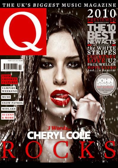
This front cover is very effective. Her facial expression plays a big part as she is giving direct address while licking her finger. This gives off a very seductive look which shows the audience that she is rebellious and sexy which helps pulls in NME's target audience as they are mostly young people and this rebellious sexy approach helps create a really effective front cover. They also draws in the audience as they will want to see why Cheryl Cole, this huge pop idol, has taken this rebellious approach as there must be a reason why she is taking this approach.
This task has helped understand how facial expressions can be used to attract an audience as well as creating an extremely effective front cover. I can refer back to this blog when making my front cover to make key decisions, such as whether or not I will use direct address which will help me create the best possible magazine.
Monday, 24 November 2014
Drafting and planning: Fonts
I have decided to call my magazine LGM, and I need to find different fonts to use. Therefore I have decided to use different fonts to use for mine.

These are the fonts I decided to use. I have kept them simple and made them quite bold to help pull in my target audience. Personally I like the second font the best as it is a bit sketchy and I think it suits my music genre which is alternative rock. My second favorite is the last one as I like how simple it is and it reminds me a lot of NME logo. Finally my third favorite is the top one as it is big bold, and effective and will help grab the readers eye. Also it will help with my left third once again helping it grab the readers eye!
Thursday, 20 November 2014
Similar Products

Wednesday, 19 November 2014
Organisation: Where to have the shoot?
I have recently been looking at two page spreads from NME and Q. Both vary in where they shoot their pictures. I need to decide whether or not to shoot my picture outside or indoors. By having a shoot outside it gives my band a bit of mystery and a bit of their personality. For example if I shot it in the town center it would give my band some class and show the audience that they are into the high life of fame and shopping etc. However if I decided to shoot my photo in the woods, my audience will wonder why it's shot their creating mystery about my band. However there are also many perks of having my double page spread shoot in door. By using the wall as a background it makes my band the main focus which will help bring in my target audience.
Personally I would like to do my front cover indoors and my two page spread outdoors, however it all depends on whether or not I can find the correct venue. This task has show me how the venue of a photo shoot can help make your target audience think and bring them in and will help me when making my two page spread.
Personally I would like to do my front cover indoors and my two page spread outdoors, however it all depends on whether or not I can find the correct venue. This task has show me how the venue of a photo shoot can help make your target audience think and bring them in and will help me when making my two page spread.
Tuesday, 18 November 2014
Similar Products: How Bands set up an image

Similar products
I need to decide how much I should make my magazine, LGM. To do this I have looked at 4 music magazine prices and used my results from SurveyMonkey. The four magazines I have used are NME, Q, Kerrang and RockSound. NME is priced at £2.50 which is quite cheap for a music magazine. Q magazine is priced at £4.99, while Kerrang is £2.20 which is very very cheap. Finally RockSound costs the most at £5! Despite RockSound costing the most it still has a circulation of 13,200, while NME has a bigger circulation of 19,491! However Kerrang has an even bigger population of 37,603, while Q magazine has a circulation of 52,781 which is the biggest of the lot. However looking at the results I got on my survey most people would only be willing to pay £2.50-£4 for a music magazine. As Q magazine is £4.99 I am cannot use that price as most people would not pay that. Therefore I am gonna go half way and price LGM at £3.50. This exercise has helped show me how price can be the difference in getting a lot more of your target audience to buy your music magazine.
Thursday, 13 November 2014
Remake Remodel feedback: Organisation
Today I got my feedback for my remake remodel task. I was praised as I have used my main image consistently on my cover, content's page, and two page spread. I have also clearly organised my photo shoots and aimed it at my target audience by using associated bands. The image on my double page spread was also praised as my cover star is showing attitude by having his hands in his pockets. This shows the readers that 'Flyn' is a bit rebellious and also makes my double page spread look like one used in a music magazine. Finally I was praised for clearly planning my product and the layout is mostly good but just needs a little bit of tweaking.
To improve I need to perhaps use the subheading for my contents page to help make the exclusive interview stand out and I should include more photo's associated with the cover lines. This will help make my work more consistent and coherent and I shall do this as it will help make my real magazine better. For my contents page as well I need to use a better image as my image looks very poor without a background. Also my music star does not really look the part in my contents page. I should also perhaps use another column to separate my other stories from my main one. For my double page spread I just need to add in more text and perhaps use a more professional font for the pull quote.
This task will help me in the future as it has shown me how I can make my work more holistic, coherent and consistent. It has also shown me how important it is to organize my photo shoot, and making of the magazine with enough time to pick out and make improvements. I can also use this feedback as a checklist when making my real product which will help me achieve a higher grade.
Wednesday, 12 November 2014
Organisation: props

Guitar
Now I could use a guitar as I may have a solo artist on my front cover and the guitar represents their music and shows the audience how much they are into music. I can easily get a guitar as I used to play, and I think this could be a good prop as it will show the audience the band members personality and look effective. However it would only work with a solo artist.
Sunglasses
This prop is best used for a band of 4 on a front cover. You usually see Alex Turner of the Arctic Monkey's wearing sunglasses, this is because it helps show the audience that he is the lead singer, and also show's him to be rebellious. Also to attract 'simpler' fans it looks cool. I have only thought of two bands at the moment but one of them is a band of 4 called Ancient Thirteen so using sunglasses as my prop is a major possibility.
If I can find anymore props to use then I will but at the moment I could use these two as they are easy to get and I currently think I will either have a solo artist or a band of 4 on my front cover. This activity will help me in the future as it will help me when deciding what prop to use
Tuesday, 11 November 2014
Drafting and Planning: NME Contents page and 2 page spread: remake remodel task

This is my draft contents page for the remake remodel task. I had my main story as Flyn in the middle with a picture and some quotes as that is what NME do and this is an NME contents page. I then drew up and index of page numbers on publisher and inserted it into paint. I then used bands usually in NME such as Arctic Monkeys and Foo Fighters. I then went and looked at NME contents page in the shops and in the issues I looked at they had prizes can be won at the top and an advertisement for a band. So I got an image of the MUSE who are usually in NME and did an advertisement for them then added in prizes to be won.
I used a white background as that is usually used in NME and kept the fonts simple and easy to read but still big and bold for effect. Finally I used WordArt to make my This week sign then put it together with an NME logo and imported it into paint, thus finishing my contents page!

One improvements I need to make is that I failed to put page numbers on my double page spread. It is vital that I include this because while it is a simply convention it is the biggest because if I don't have page numbers then my target audience won't know where my main story is. Also there is not a consistency between my front cover and contents page, as Coldplay does not feature on my contents page but is on my contents page.
This task will help me in the future as it has helped me find out what I need to include when making a contents page and a two page spread!
Saturday, 8 November 2014
Target Audience
I have decided to look at NME magazine and Q magazine to help me learn what will help attract my target audience. I used these two magazines as the are the same genre as my magazine, LGM and have the same target audience as me, alternative rock fans!
FRONT COVER


CONTENTS PAGE


Q's contents page is very different to NME! It has the main cover star taking up most the page and the arrow indicates to the reader the interview is on the next page making it quick and easy for Q's target audience to recognize the cover star then read the interview. The index is on the left giving the reader an insight with the main stories in bold, like NME's drawing in the target audience as they can see if their favorite band is in that issue. There is also a summary of another story across the bottom making the reader buy the magazine to read the extra story (like a screamer)!
Both of these contents page help get the magazine's target audience by having an image of the main cover star, and the interview page and in the index having each section in bold to show their target audience that their interest is in the magazine. I will use both of these things in my contents page and will also add a subscription ad in it like NME's!
Double Page Spread

This is Q's double page spread of an interview with Ed Sheeran. It keeps to the conventions of a two page spread by having the main image on one side and the interview on the other. What grabs their target audience here though is the colour's used. It really complements the picture of Sheeran and London and is used in Q's colours, red and white. However the fact that the colour scheme is so simple makes it effective and draws in the reader. Also the photo make's Sheeran easy to recognize bringing in his fans and the picture of Big Ben is an excellent background as it makes Sheeran the main attraction.Also there is a pull quote giving the reader an insight into the interview. Finally the fact that Sheeran isn't looking at the camera helps bring in the audience as it shows he's a bit rebellious as he is not giving direct address.
 This is NME's double page spread from their interview with Arctic Monkeys. Once again the colours are simple, black on white, thus making it easy to read and effective and the main image is on one side with the interview on the other. However this double page spread gets the target audience attention as the pull quote is used in a different font. This font is a nice big bold font making it easy to read but as there are lines everywhere it shows a bit of the bands personality, implying that they are rebellious. This contradicts the picture where they are giving direct address making them seem innocent. This will only make the reader want to buy the magazine to read the interview to find out what the band are really like.
How Will This Help Me?
This activity has helped me a lot when drawing up a plan for my front cover, contents page and double page spread. It has shown me what is needed to attract target audience, such as how many cover lines I need, whether or not to use pugs, showing me to keep the colour and fonts simple and clearly telling them where everything is on the contents page. It has also showed me how I can portray my bands personality's by using direct address or not!
FRONT COVER
This front cover is of Coldplay from Q magazine. First off is that the main cover stars are an alternative rock band which will grab their attention. But also in the cover lines are other alternative rock bands which will grab more fans who are not fans of Coldplay, the main cover stars. There are the typical codes and conventions such as a bar code and left third, but what grabs the audience is that all the cover stars are looking straight at the camera giving direct address to the reader, thus pulling them in.
This is a front cover from NME magazine and is similar to the Q one. Once again the main cover stars are an alternative rock band and are giving the audience direct address. However what pulls in the reader is the fact that at the top it has 'special collectors magazine' and all the cover lines are about Arctic Monkey's, not other bands. This will help not only get in plenty of Arctic Monkey fans but also people who are 'collectors' of the magazine.
Both these front covers do not contain pugs and or a screamer which have been used on other front covers. This is another way to attract target audience and I will use them on my front cover despite them not being on these front covers. Also these front covers have taught me not to use more than 5 front covers, letting the focus stay on the cover stars and to keep the fonts simple.
This is NME contents page and this is extremely effective in pulling in their target audience. First off they have a picture and a summary off the main story giving the audience an insight into the main interview and getting them hooked as they will want to read the rest. Next on the right hand side they have a brief index on where things are with the topic in bold eg features and reviews. This is helpful as it will show the reader where the story is which they want to read, saving them time or letting them now it's in there making them buy the magazine. Finally on the left there is a index with what is on every page once again giving the reader an insight.
Both of these contents page help get the magazine's target audience by having an image of the main cover star, and the interview page and in the index having each section in bold to show their target audience that their interest is in the magazine. I will use both of these things in my contents page and will also add a subscription ad in it like NME's!
Double Page Spread
This is Q's double page spread of an interview with Ed Sheeran. It keeps to the conventions of a two page spread by having the main image on one side and the interview on the other. What grabs their target audience here though is the colour's used. It really complements the picture of Sheeran and London and is used in Q's colours, red and white. However the fact that the colour scheme is so simple makes it effective and draws in the reader. Also the photo make's Sheeran easy to recognize bringing in his fans and the picture of Big Ben is an excellent background as it makes Sheeran the main attraction.Also there is a pull quote giving the reader an insight into the interview. Finally the fact that Sheeran isn't looking at the camera helps bring in the audience as it shows he's a bit rebellious as he is not giving direct address.
How Will This Help Me?
This activity has helped me a lot when drawing up a plan for my front cover, contents page and double page spread. It has shown me what is needed to attract target audience, such as how many cover lines I need, whether or not to use pugs, showing me to keep the colour and fonts simple and clearly telling them where everything is on the contents page. It has also showed me how I can portray my bands personality's by using direct address or not!
Thursday, 6 November 2014
Organisation
Today we peer assessed each others remake remodel task. This let me know what was good about my magazine and what I need to improve on. I have used most of the codes and conventions and got the right lighting thanks to my organisation over 2 weeks.
However I need to improve on getting clear image which will help show the audience who is on my magazine. Therefore I need to work better on organizing a photo shoot so that my pictures are clearer and my work can be improved!
This task will help me improve my work as it has showed me that I need to use my organisation a bit better when it comes to getting a photo!
Wednesday, 5 November 2014
Drafting and planning: Content pages

This is a content page from NME magazine. As my music magazine LGM is based on NME, I will use this contents page as a base when making mine. What I like about this contents page is that the main story has a big picture and a little paragraph summary. This helps draw the reader in and tells them what is in the interview, giving the reader an insight so I will use this in my contents page for my main story. The image used also gives the reader an insight as it shows what band is being interviewed. I also like how on the right is other major stories but they are divided into categories, like 'Live' and 'Radar'. This makes it easy for the reader to find the specific category they want. However I think that is enough when telling the reader what page everything is on so I would get rid of the left column of index when making my contents page. Instead I am going to use that space to advertise subscription, and will then use any empty space for company info and who produced the magazine. It is important that I find space for this because by giving details about the people who produce my magazine I will be giving my readers and insight into how big LGM is. Also a subscription add helps pull in readers who are really into the magazine and want to buy every copy so it is crucial I have space for that.
Tuesday, 4 November 2014
Target Audience :remake remodel task

This is my magazine cover for the remake remodel task. I decided to use NME as my magazine as that is what I am basing my real music magazine on. I decided to do a a long shot of my cover star so you can see his arms crossed and this shows the audience that he is rebellious. I then put my main cover line in red so it is clear that is the main story. The colour red shows that it is the main story because it is bright thus catching the target audiences eye, and all of the other lines are in a different colour, therefore showing the target audience the distinct difference in the stories.I also used major bands to help get my target audience as bands like Arctic Monkeys and Foo Fighter are very popular. Also Arctic Monkeys and Foo Fighters are bands that really appeal to NME's target audience which is mostly indie/rock fans. I also used a pug by offering a Coldpaly signed album and a Kings of Leon interview to once again help reel in my target audience.http://lewisglennonmediawork.blogspot.co.uk/2014/09/drafting-and-planning-nme-creative-task.html. I also kept the generic codes and conventions such as barcode, website, price, and dateline. It is key to add in this codes and conventions because they are part of my magazine, and if I don't include them, then my work is not meeting the task of making a music magazine. This is a link to my NME creative task I did near the start of the course. This helped me when importing pictures from Paint.Net to Publisher to add cover lines etc, and has helped me with this piece of work.
Sunday, 2 November 2014
Drafting and Planning

Also the photo shoot being shot outdoors by a caravan. This adds mystery to the band as you don't usually see a double page spread in a music magazine being outside. Also this will help pull in the reader as they will want to know why the band have been shot there because it does not really reflect the band, thus adding mystery.
NME use this a lot, but not many other music magazine's do and if I use this in my two page spread it will make mine look more professional and tell the audience who my lead singer is. Therefore in my photo shoot I will bring props for my lead singer and make the other band members stay in the background to distinguish them from the rest of the band!
Wednesday, 29 October 2014
Organisation
I have decided when I am going to do my magazine front cover photo shoot and who I am going to include in it. Firstly I have drawn up five fake bands to use of my cover and the main cover stars will be a alternative rock due called D and B. I have decided to do a due as there are not many famous alternative rock due's out there so I thought it would be different, however I could still change it. I will use two of my friends for 'D and B' and will shoot it in the drama studio due to the lighting being better than other venues; ie my house.
I intend to use a mid shot for D and B so the audience can see their body language and can get a feel to their personalities. However I will also shoot a few more of my friends in the drama studio's so I can decide which band would look best on the front cover if I don't like how my D and B idea comes out. I will shoot 'Ancient Thirteen', which will include 4 friends and 'American Sound' as well in the drama studio. Hopefully I can get the shoot around the middle of November which will give me enough time to plan everything so it all runs smoothly.
I intend to use a mid shot for D and B so the audience can see their body language and can get a feel to their personalities. However I will also shoot a few more of my friends in the drama studio's so I can decide which band would look best on the front cover if I don't like how my D and B idea comes out. I will shoot 'Ancient Thirteen', which will include 4 friends and 'American Sound' as well in the drama studio. Hopefully I can get the shoot around the middle of November which will give me enough time to plan everything so it all runs smoothly.
Tuesday, 28 October 2014
Organisation
Using https://www.surveymonkey.com/s/BFM26QM I have found out what type of music genre my magazine will be. I am gonna make my music genre an alternative rock magazine as that is what most people who did the survey enjoy the most.Also using survey monkey I found out that most people between the age of 19-25 listen to alternative rock so that is who my target audience will be! This helps me to find out what age group I should be aiming my music magazine at.

Thursday, 23 October 2014
Drafting and Planning: How to improve my codes and conventions
Recently in class me and a partner analysed each others codes and conventions task,http://lewisglennonmediawork.blogspot.co.uk/2014/10/drafting-and-planning-5-cover-pictures.html. This is my feedback on my work!
Looking at my partners comments I generally think that the fonts I used fitted in with the philosophy of each magazine and they all look realistic! Also I was praised with correctly sizing the fonts in some front covers (M magazine) used and all my cover lines are relevant to the magazine genre's.
Despite correctly sizing the fonts for the two M magazines, I did not use the right size fonts for the other magazines. It is important that I get the size of the fonts correct so other cover lines and pugs stand out more effectively. To help do this I shall look at other magazine fonts and try to size it using the fonts used on actual music magazine covers!
This task will help me in the future as I can figure out what sizes are the best to use to help benefit my magazine, and how to appeal to my audience using things such as pugs. All of this feedback will be useful when making my real magazine as I will know what to include to make the magazine look as best as possible and to stop me making basic errors.
Wednesday, 22 October 2014
Similar products: shots used on front covers

This is a front cover of the band the killers. There is a long shot of the band and this is used to make them the main attraction as there body takes up the whole front cover. It also let's the audience see the body language of each band member, and this helps show them what they are like and if they have attitude or not. The Killers are all standing rather casual implying that they have a bit of attitude (one of them with his hands in his pocket) but not very rebellious as the cover star with his hands in front of them looks very serious.

This is a front cover from NME. It has a mid shot of Arctic Monkeys. This shot helps make Alex Turner stand out as he takes up most of the cover with the rest of the band standing back implying that he is the main singer of the group. Mid shot's can also be used to help show the personalities of the band, but it is also used to show who is the leader of the band as shown here.
By doing this task I can decide which camera shot is best to use on my magazine front cover. I can decide which shot will best give the audience a bit of an insight into the bands personality.
Tuesday, 21 October 2014
Drafting and planning: 5 cover pictures

This is my magazine cover for the music magazine M. On the front cover is rapper Drake. As the magazine is a niche market I decided to look up other niche magazines and most the fonts they use is simple and brightly colored. So I used simple fonts for my front cover, I made my main cover line in red as it is the main story of the magazine so I want to keep it simple. Also the colour red represents Drake a little as the connotation of red is danger and Drake has the image of being a 'bad boy' with attitude. I then made the cover lines just looking up main stories from the music world. On one of the cover lines I also used a young up and coming music star and portrayed him as the next Drake, to complement the main cover star Drake, as well as pulling in the audience, by acting as a screamer, as the audience will be desperate to see who the 'new Drake' is and why he has been proclaimed as that.

This is my second magazine for M and I decided to call the band Quasi Hendrix. I got this name using the random band name generator, and I decided to make them a hip hop band as I think they look quite hip hop due to their glasses. I then added three more cover lines and once again kept it simple as it is a niche magazine again. I decided to put the main cover line in white to show purity about the band as well as complementing the background. I also included a screamer near the masthead to do with Eminem as this will help me attract an audience who perhaps are not a big fan off hip-hop but like rap.

This is my third magazine for Music X which is appeals to a cult audience. As you can tell by the background its is a very dark background but the picture of 'BJORK' has a bit of red in it which is why I made my main cover line red to complement it! I then made the other covers line white as it compliments itself on a black background. The fonts I used were more sketchy then the simple fonts I had used before. This was because the image is very dark and sketchy itself so I made the fonts like this to complement and tie in with the cover.

This magazine was mainly rock oriented and has Marylin Manson on the front. Them background is not that dark so I made the cover lines red bar one so they complement the background. I then used a black sketch font, which you usually see on rock oriented magazines as the main cover line. Once again I had to look up bands like Ghost Dance and find out what type of stuff Manson says as I don't know to much on this type of music.

I personally found this the hardest magazine cover to do as the main cover line was supplied for us at the bottom of the page and in a weird font. However I added to that and made it big and bold so it's easy to read. However I kept the main cover lines simple and not as big as usual so that it does not take it away from the main cover stars. I put them in red to fit with the background and to make it similar to the masthead.Red is also used in alternative rock magazine which I decided to make this magazine. I also included bands and events that are similar to Kings Of Leon to help attract alternative rock fans. I also included a screamer by showing the reader that inside is a segment on how Kings Of Leon got to top. This will appeal and attract hardcore fans of King Of Leon as it gives an insight into their career.
Subscribe to:
Posts (Atom)