These are the photo's I decided not to use for my double page spread .There are many reasons why I chose not to use these pictures.
Double Page Spread Pictures


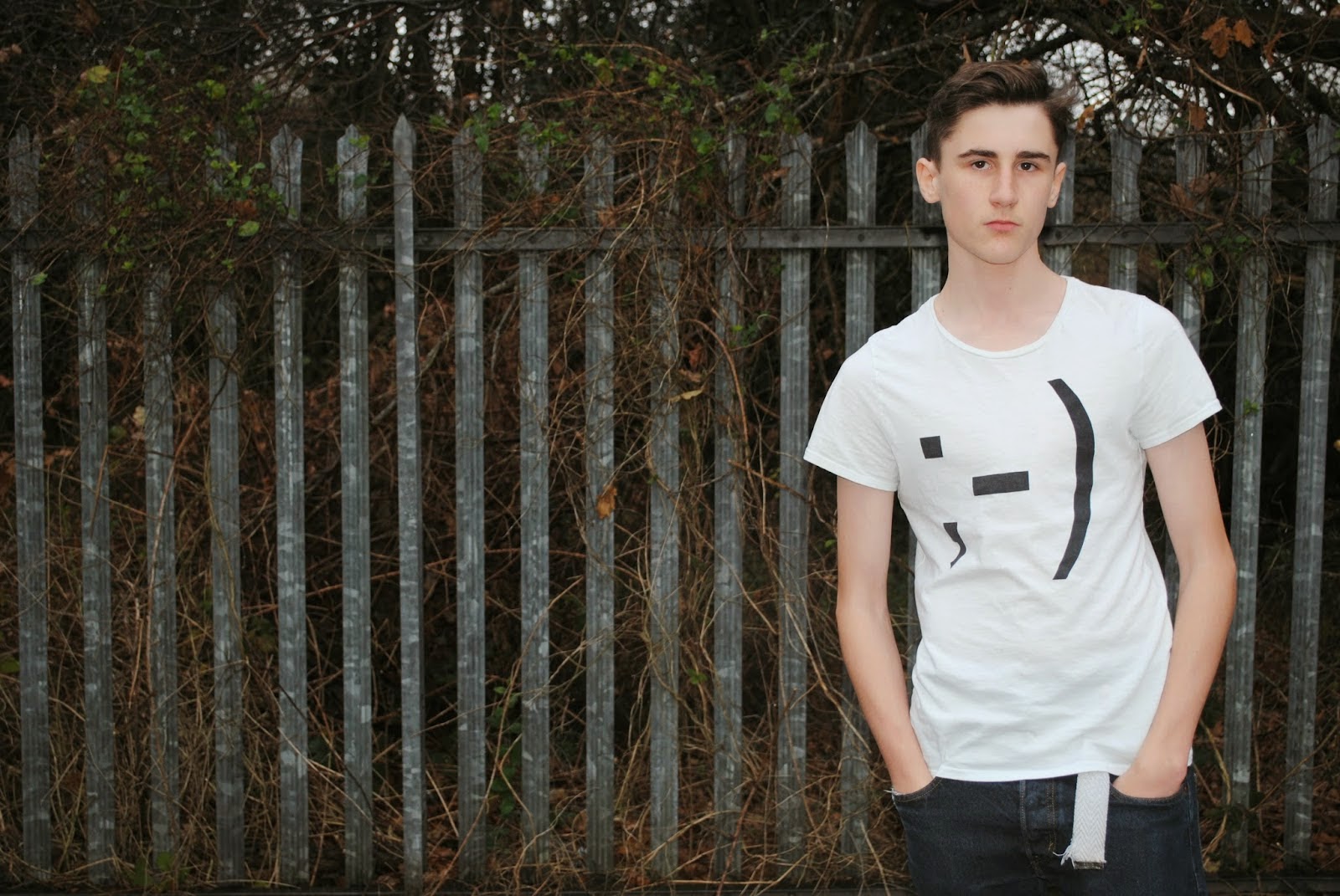
These are the four images I took for my double page spread, however I decided not to use these images. I was going to use the first one as it is a great picture with the natural lighting being perfect for the picture, as well as there being space for the pull quote. Also the hands in pockets, show a none caring attitude which fits in with my story about 'Jake.' However I decided not to use this image because I thought it was to spacious. As I used quite a small pull quote it would of left to much free space on my double page spread and looking at Q's double page spreads it has space but not to much of it. Also I wanted Jake to give the reader direct address to engage with his audience as he is retiring from music and while the first image is good, he is not giving direct address, and that is why I decided not to use that image. The second and third images are very similar and once again I like the light and the cover stars pose, but as he is standing centrally it would of been very difficult to add in my pull quote as I would be working in a very small space. Finally the final picture has the perfect amount of space for me to add in a pull quote and make a good double page spread as Jake is standing to the right. However after importing this image in PagePlus I discovered that Jake is hanging off of the two page spread which I do not want, and when I tried to crop the photo it did not look as good which is why I did not use the final image for my double page spread.
No comments:
Post a Comment